


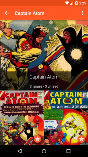

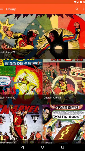
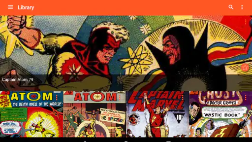
I approached Astonishing Comic Reader as someone who wants comics to feel easy to pick up, not like a small technical project before the first page. Developed by Studio Zero Games, this free comics app has a clean, focused purpose: help me read digital comicbooks without surrounding the experience with unnecessary clutter. That simplicity is its strongest idea, although it also means the app is best suited to readers whose collections and reading habits fit its particular approach.
After spending time with it, I found the most interesting question was not simply whether it opens comics. Most readers can find an app that does that. The more useful question is whether the reading experience remains comfortable when my eyes are tired, when I am using a smaller phone, when I am holding the device one-handed, or when I want to move quickly through a large collection. Those everyday details reveal where this app feels thoughtful and where another reader may be a better match.
Reading comfortably starts with a clear page
The app’s appeal begins with concentration. It is made for comics rather than trying to become a general media shelf, social feed, or recommendation service. That narrow purpose helps the reading screen feel more direct. I can give my attention to the artwork and dialogue instead of constantly navigating around unrelated controls.
For readers who are sensitive to visual clutter, this is a meaningful advantage. Comic pages already contain many competing elements: speech balloons, captions, sound effects, borders, textures, and detailed backgrounds. A reader interface that stays quiet around the page can make the content easier to follow. I especially appreciate that distinction when switching between short reading sessions during the day, because I do not have to mentally reorient myself to a crowded dashboard each time.
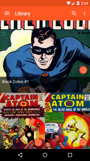
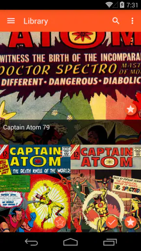
Navigation matters just as much as appearance. A comic reader should make the basic actions predictable: opening a book, moving through pages, returning to the collection, and continuing where I left off. Astonishing Comic Reader is at its best when I treat it as a straightforward shelf and page viewer. It does not ask me to learn a complicated reading system before I can start.
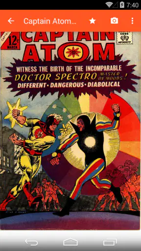
That does not mean every comic becomes equally easy to read. A page designed for a large screen can still feel cramped on a phone, particularly when lettering is small or several panels share one page. Enlarging a page may improve legibility, but it can also force extra movement across the artwork. That trade-off is inherent to fixed comic layouts, and it is worth remembering before choosing any reader for long sessions on a compact display.
I would recommend beginning with the display setting and reading direction that feels most natural rather than accepting the first arrangement automatically. A reader who prefers to inspect full pages may value the original composition, while someone following dialogue panel by panel may prefer a more guided approach when available. The practical tip is to test both during a quiet chapter, not during an important scene: that makes it easier to notice whether movement, zooming, or page transitions are helping rather than interrupting comprehension.
Why the interface can help different reading styles
Some people read comics slowly, studying color and layout. Others move quickly, following speech and turning pages almost automatically. A focused reader can accommodate both habits better than a heavily decorated alternative because it does not compete with the material. I can pause on a page without feeling pushed toward another action, then resume when I am ready.
For a reader with attention difficulties, that reduced distraction can be useful. It does not solve every concentration problem, and I would not describe it as a specialized support tool, but the limited purpose is still valuable. The app keeps the central task visible: read the page in front of me.
There is also a practical benefit for people who share devices or read in different places. A simple presentation makes it easier to hand the phone to another person without explaining a long chain of controls. That can matter when showing a favorite panel to a friend, reading beside a child, or letting someone browse a collection who is unfamiliar with digital comic apps.
The age classification is Everyone, which fits the app’s role as a comics-reading tool rather than an adult-only service. That classification should not be confused with the content of every comic a reader may open. The app’s rating describes the application, while the books themselves can have their own themes and suitability. Parents should still choose the files and titles thoughtfully instead of treating the app’s classification as a guarantee about all imported reading material.
Small habits that make page reading less tiring
One useful habit is to avoid judging readability from the cover or opening page alone. Covers often have large lettering and bold artwork, while interior pages may contain dense dialogue and narrow panels. I check a typical middle page before settling into a long session. If the lettering already feels borderline at the beginning, it will become more tiring after several chapters.
I also find it better to use zoom deliberately. Repeatedly pinching in and out for every panel can turn reading into hand exercise, especially for anyone with limited finger strength or joint pain. When possible, I choose a page view that lets me read several panels at a comfortable scale, then zoom only for unusually small text. This reduces repetitive gestures and preserves the rhythm of the story.
Another simple improvement is to read in shorter blocks when the artwork is particularly dense. A beautiful double-page spread may demand more visual scanning than a dialogue-heavy page. Pausing at natural scene changes gives the eyes a break without making the story feel fragmented. That advice is not unique to digital reading, but the app’s uncluttered presentation makes it easier to stop and resume without losing the place.
Controls, senses, and everyday situations
Accessibility is not only about whether text can be seen. It also includes how much reaching, tapping, dragging, and visual searching the reader must do. In my experience, a dedicated comics app has an advantage over a generic file viewer because its main interactions are built around turning pages rather than managing documents. That can make casual reading feel less demanding.
Still, the physical experience depends heavily on the device. Someone with limited dexterity may find one-handed page turning comfortable on a smaller phone but awkward on a large tablet. Someone with tremors may struggle with gestures that require precise contact. The app’s simple purpose helps, but it cannot remove the physical demands of holding a device, touching the screen, and repositioning a zoomed page.
This is where a stand or case with a stable viewing angle can make a bigger difference than another setting. On a desk, I can keep both hands relaxed and avoid gripping the phone throughout a chapter. In bed or on public transport, the same reader may require more frequent repositioning. I would treat the reading environment as part of the setup, especially for people managing fatigue, pain, or reduced hand control.
Visual sensitivity also deserves attention. Comic art can contain sudden contrast changes, busy textures, bright colors, and large sound effects. A clean reader interface cannot soften the source material itself. If a particular series feels visually overwhelming, choosing a calmer title, reducing session length, or increasing the distance from the screen may help more than changing apps.
For readers with low vision, the main trade-off is between seeing the whole page and reading the lettering comfortably. Full-page viewing protects the artist’s layout but may shrink text. Zooming improves detail but can separate panels from their surrounding context. I recommend deciding which information matters most in the moment: follow the dialogue first, then return to the artwork, or preserve the full composition and accept slower reading. Neither approach is universally correct.
People who rely on audio rather than visual reading should be cautious about choosing this app as their primary comics solution. A page-based comic reader is fundamentally visual, and the storytelling depends on artwork, lettering, and panel order. It may complement other tools, but it is not the right starting point for someone who needs a fully spoken reading experience.
Using it outside the ideal reading chair
A realistic use case is a short commute. I might open a comic while waiting for an appointment, read a few pages, lock the phone, and return later. That kind of stop-and-start session is where a focused reader earns its place. There is little reason to open a full desktop-style workflow for a ten-minute break.
On a crowded bus or train, however, one-handed use becomes more important. I would test page turns before committing to a long ride, because a control that feels effortless with two hands may be inconvenient while standing. Holding the device lower, using a stable grip, and avoiding aggressive zooming can reduce the number of precise gestures required.
At night, the issue is not only brightness. A bright screen can disturb someone nearby, while a dark room makes page details harder to judge. I prefer a moderate screen level and short sessions rather than reading until my eyes feel strained. If the comic itself uses very dark artwork, lowering brightness too far can erase important details, so the best setting depends on both the environment and the page.
For readers who experience motion sensitivity, rapid transitions or repeated movement across zoomed pages may be uncomfortable. The safest approach is to keep the page stable, avoid unnecessary swiping, and use the simplest navigation pattern available. If a particular reading mode feels animated or disorienting, switching back to a static page view is worth trying before abandoning the app entirely.
Where the experience still has limits
The biggest limitation is that “simple” can mean fewer ways to adapt the experience. Readers with very specific needs may prefer a more configurable comic platform, especially if they want extensive typography controls, granular panel navigation, or a workflow designed around assistive technology. Astonishing Comic Reader’s focused design is pleasant when it matches my habits, but less flexible when I need the application to compensate for a difficult reading situation.
There is also a difference between organizing a personal comic collection and relying on a service built around discovery. If I want recommendations, community interaction, subscriptions, or a broad catalog presented inside the same product, a specialized storefront or digital comics service may be more suitable. This app makes more sense to me when the priority is reading, not browsing an ecosystem.
Its free price lowers the barrier to trying it, which I consider important for readers who are unsure whether digital comics will work for them. In-app purchases range from ninety-nine cents to two dollars and ninety-nine cents per item, so I would still check what an optional purchase changes before spending money. The app does not need to be expensive to become inconvenient if paid extras are not relevant to my reading habits.
The long presence of the app is another part of its identity. It was released on February 9, 2014, and has built a substantial audience since then, with over one million installs and an average rating of 4.5 from around twenty-eight thousand ratings. Those figures suggest that the basic reading concept has found a durable audience, but popularity does not remove the need to test the interface against personal requirements. A reader with unusual motor, visual, or navigation needs should make the decision from hands-on comfort, not reputation alone.
Its review volume, around two thousand three hundred reviews, also gives the app a visible history of user reaction. I see that as useful context rather than a substitute for accessibility testing. A high average can tell me that many people enjoy the product, but it cannot predict whether a particular gesture, page scale, or contrast level will work for my eyes and hands.
Another barrier is the comic file itself. If lettering is embedded in the artwork, no reader can magically turn it into clean, resizable text in the way an ebook reader can. That means the app may feel excellent with one publisher’s page design and frustrating with another’s. Before building a large digital collection around it, I would sample several kinds of comics: a spacious modern page, a dense older issue, and a book with small captions. This is one of the most useful tests because it exposes problems that a polished cover will hide.
Who should choose it, and who should look elsewhere?
I think it is a strong fit for someone who wants a dedicated, uncomplicated way to read comics and values a calm interface over a long list of advanced controls. It is also a sensible first try for a casual reader who does not want to pay upfront. The Everyone age classification makes the application itself approachable for a broad audience, while the reader remains responsible for selecting age-appropriate books.
I would be more hesitant to recommend it as the only option for someone with low vision who needs reliable text enlargement, someone with limited dexterity who cannot comfortably perform repeated gestures, or someone who depends on nonvisual access. In those cases, a reader with stronger customization or a platform designed around accessibility may be a better investment of time, even if its interface is less elegant.
It may also be the wrong choice for a collector who wants the app to manage every part of a comics lifestyle. If discovery, purchases, cloud-based organization, or social features matter more than the page itself, the usual alternatives in the comics category can offer a broader environment. I prefer Astonishing Comic Reader when I already know what I want to read and want the software to stay out of the way.
My inclusive verdict
Studio Zero Games has made a free comics app whose most convincing feature is restraint. It gives the page room, supports quick reading sessions, and avoids turning a simple activity into a complicated dashboard. For many people, that is an accessibility benefit in practice: fewer distractions, fewer decisions, and a clearer path from opening the app to reading a panel.
My recommendation comes with a practical condition: judge it using the comics you actually plan to read and the device you actually hold. Check a dense page, try a short session when your eyes are tired, and notice whether the gestures feel comfortable rather than merely possible. If those tests go well, the best reason to choose this app is its focused reading experience, not a long list of promises.
With over one million installs and a 4.5 average, it is clearly more than an experimental viewer, and its free entry point makes trying it easy. I would recommend it to casual and committed visual readers who want a clean place for their comics. I would skip it as a sole solution when I need extensive accessibility controls, nonvisual reading, or a complete comics marketplace. In short, it is a welcoming starting point for many readers, but inclusive design also means recognizing when a different tool fits a person’s body, vision, and reading context better.


